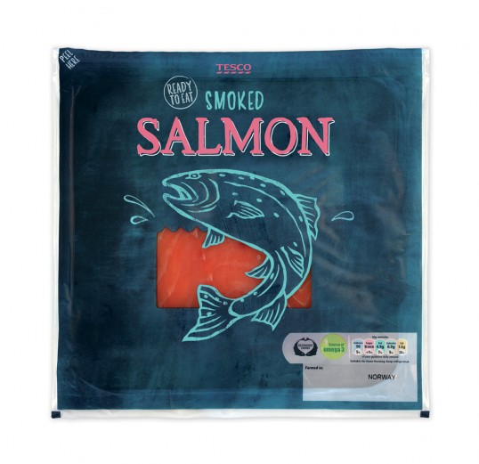
Supermarkets
Retail
Advertising Agencies
Dental surgeries
NHS
Health sectors
Food and Drink sectors
Agriculture
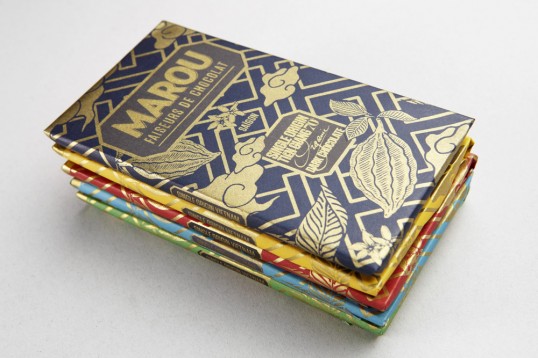
Packaging
Book stores/covers
Fashion
Music Industry
Publishing
Education
Illustration, packaging and publishing
1. What skills / interests you have and how they relate to the needs of your client group?
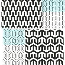
I am extremely interested in image based design, with a keen eye for pattern and illustration. A lot of my work ties together illustration with hand drawn type, featuring application of this across a number of different formats. I like to be quite playful with my designs, as this allows me to reflect my personality within my work, and I therefore work with colours that represent this.
My interest in fashion and retail pushes me towards certain briefs, and undergoing certain projects. Therefore I will often target an audience that I am familiar with and have an understanding of. For example, during the responsive module, a lot of my briefs were for retail products and featured illustrative pattern. I am extremely interested in seeing how this can create visual shelf appeal, and looking at the experimentation of prototypes and mock ups.
2. What skills are needed and what skills do you want to develop?
As I am keen on illustrative work, I need to make sure that my visual approach is identifiable, and will stand out against everything that is already out there. It is good to have a strong sense of who you are and what you're about in terms of design, as this will allow client groups to recognise and determine your work.
In order for my illustration to be strong, I continue to practice my drawing skills on and off paper. I tend not to like designing straight onto the computer, and therefore draw out a lot of my illustrative designs before turning them into screen based products. Recently, I have been using a graphics tablet, and this has allowed me to create my designs at a much faster and efficient pace.
In terms of skills that I want to develop, I want to make sure that my type is as strong as my image. Image is only half of the problem, and I need to make sure that I also focus on content and type. Whilst I explore hand drawn text quite a bit, it is essential that I work on this.
3. What are your professional/creative aims and how do they relate to the needs of the client group?
My professional and creative aims have a direct link to my skills. I want to make sure that type and image is used in a way that allows me to create shelf appeal and really connect with my audience. I want to continue experimenting with my current way of working, but pushing this more towards the application of pattern in retail and packaging.
In terms of professional skills, presenting my work is key. This is not just in terms of proposals, but also the photographing of my work. I need to make sure that I have the confidence and the ability to pitch my concepts, but also display the end product to the highest standard possible.
The Artworks - design agency
Debbie Powell


Mary Woodin


Sara McMenemy