Ten examples of each discipline, categorised.
Information and Way-finding design
1. Guys & St. Thomas' Hospital NHS (Endpoint Sign design)
genre: medical, signage
audience: wide breadth of audience, patients, visitors and staff
content: way-finding, signage, floor coverings, lighting, decorating and environmental graphics
sector: health
budget: unknown but took three years to complete
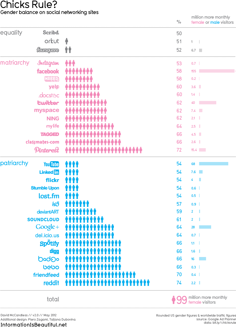
2. Gender balancing on social networking sites (Information Is Beautiful)
genre: social networking
audience: males and females signed up to a number of networking sites
content: gender balance
sector: infographics
budget: unknown
3. College of Music (Terada Design)
genre: way-finding, education
audience: pupils and staff
content: way-finding, signage, hallways and ceiling colours
sector: way-finding
4. Top 21 albums of 2011 (Information Is Beautiful)
genre: music, visualisations
audience: music enthusiasts
content: top 21 albums of 2011 defined by country
sector: infographics and visualisations
5. Eureka Tower car park (Alex Peemoeller)
Alex Peemoeller - a man with the best name ever and an extremely cool website
Playful use of perspective, livening up what is normally quite a boring and dull space to be in
genre: signage
audience: drivers and pedestrians
content: directions and commands
sector: transport
http://thevelvetprinciple.com/blog/?p=64
^^^ interesting article on improving the multi-storey car park
6. Star City (BrandCulture)
genre: way-finding, casino
audience: gamblers and staff
content: retail, commercial and entertainment spaces
sector: entertainment
7. USA map design (Creative Roots)
genre: travel
audience: travellers
content: states of the USA
sector: map design
Product and Packaging design
beverages
spirits & liquor
beer & malt beverage
books & media
fashion
food & gourmet
home & garden
pets & animals
kids & baby
office & art
technology
tobacco
wine & champagne
bag & film
carton
jar
molded fiber
paper & board
plastic bottle
plastic & pvc
pouch
specialty
sustainable
glass bottle
tin, metal, foil
wood
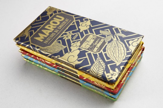
1. Marou chocolate (Rice Creative)
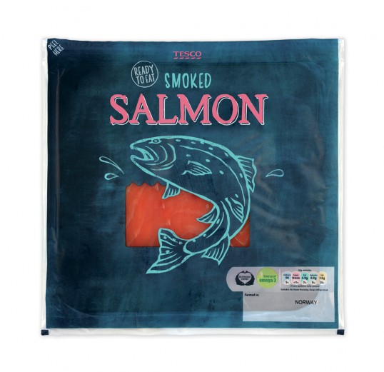
2. Smoked salmon (R Design)
3. Moroccan Oil (Berard Associates)
4. Fur die Feinen Leute (Marco Stormer)
genre: letterpress, design packaging
5. Coconut water (Michelberger Hotel)
6. NIKECraft Collection (Tom Sachs)
7. Betjemen and Barton (Chris Mann)
8. Berkeley London (Construct)
9. Tiny Fruit (Little Duck Organics)
10. Darling (Dima Je)
Industry
beauty & healthbeverages
spirits & liquor
beer & malt beverage
books & media
fashion
food & gourmet
home & garden
pets & animals
kids & baby
office & art
technology
tobacco
wine & champagne
Substrate
aluminumbag & film
carton
jar
molded fiber
paper & board
plastic bottle
plastic & pvc
pouch
specialty
sustainable
glass bottle
tin, metal, foil
wood
1. Marou chocolate (Rice Creative)
genre: confectionary
audience: more up-market buyers, gourmet chocolate
content: building visual identity and packaging
sector: packaging
2. Smoked salmon (R Design)
genre: fish, supermarket products, food
audience: shopper, up-market
Sector: food packaging for fishmongers/fish market
content: All the typography was hand drawn and paired with illustrations that highlight the fish type. On the standard plus lines the illustrations change from the fish to that of the flavour or ingredient that comes with the product. e.g. King Prawns with Chilli & Coriander.
Bright colours are used throughout both ranges to differentiate between the fish type and create hierarchy within the product titles and descriptions. The design was able to adapt across several pack formats achieving a consistent look across the range and strong stand out on shelf as well as engaging the consumer - R Design
3. Moroccan Oil (Berard Associates)
genre: hair care
audience: female majority
content: overall brand analysis
sector: packaging design for line of hair care products
4. Fur die Feinen Leute (Marco Stormer)
genre: letterpress, design packaging
audience: designers, artists
content: packaging for billiards equipments
sector: packaging, equipment
5. Coconut water (Michelberger Hotel)
http://www.michelbergermonkey.com/
The story of the monkey
genre: drinks
audience: drunk with alcohol therefore older audience, also drunk as a lighter alternative to milk on cereal (those looking after their weight)
content: 'The brand is based around the character of a superhero Monkey (the story of which you can read on the accompanying website michelbergermonkey.com), and he is featured on the can, wrapped around it. When 3 cans are placed together, you see the whole image of the monkey which increases shelf presence of the drink. We used a can with a rippled design to echo the sea which is used as a story theme and design element in the website artwork.'
sector: drinks packaging design specifically for a hotel
6. NIKECraft Collection (Tom Sachs)
genre: sportswear
audience: youthful male and female audience interested in the brand
content: 'Nike design and Sachs applied materials that have never been used in sportswear, taken from automotive air bags, mainsails for boats and the space suit itself. Each piece is packed with functionality that would prove useful in the voyage through space. Zipper pulls that double as storage containers, paracord that can be fashioned as a tourniquet and embellishments like the periodic table of elements screened on the inside of a jacket - they all merge visual interest with purpose'
sector: clothing and footwear
7. Betjemen and Barton (Chris Mann)
genre: drinks, tea
audience: up-market tea enthusiasts - classic French tea company
content: 'Betjeman & Barton takes pride in their rich history and tradition. It is the perfect mixture between the fancy French and serious British. I wanted to suggest this concept by mixing the traditional woodcut illustrations of Frasconi with punches of bright contemporary colour.'
Sector: drinks packaging
8. Berkeley London (Construct)
genre: confectionary
audience: those willing to spend a lot, sold at five start luxury hotel in Knightsbridge
content: 'The understatement of the logotype is balanced with an innovative and flexible branding palette, allowing the hotel to engage in a sensitive dialogue with it's guests, turning up the wit and energy where appropriate and keeping things simple where required. The colour palette is a refined cool blue, soft grey, deepest inky blue/black and fresh white, inspired by the hotels iconic blue bar. The branding palette includes a bespoke geometric pattern, a clean technical line drawn illustration and bold use of typography and tone of voice.'
sector: exclusive food and drink
9. Tiny Fruit (Little Duck Organics)
genre: organic snacks
audience: kids and baby, parents
content: organics snacks, tiny snacks for tiny humans
sector: kids and baby, organic food
10. Darling (Dima Je)
genre: animal treats
audience: pet owners
content: fun dog food packaging for young, adult and old pets
sector: pets and animals, packaging design
Branding and Identity design
1. Freedom Foods (Yellow Brands)
Before:
genre: advertising and re-branding, cereal packaging
audience: 'better food for everyone'
content: honest, nutritious and free, reposition selves from dishonest health claims and scientific jargon
sector: food rebranding
2. Love & Toast (Margot Elena)
3. Habitat (GTF)
4. Design Museum (GTF)
5. Fruita Blanch (Atipus)
6. Waitrose (Pearlfisher)
7. Innocent Smoothies (Pearlfisher)
8. Help (Pearlfisher)
9. This Water (Pearlfisher)
10. Abbey Road The Beatles (Wolff Olin)
1. Freedom Foods (Yellow Brands)
Before:
After:
audience: 'better food for everyone'
content: honest, nutritious and free, reposition selves from dishonest health claims and scientific jargon
sector: food rebranding
2. Love & Toast (Margot Elena)
genre: high concept bath and beauty
audience: sold at Urban Outfitters, unique and high-end, those willing to spend a lot on beauty products, females
content: 'Conceptually, Margot Elena was envisioning a loose creative vibe with Love & Toast, what she refers to as “Brit Pop Folk Art.” Drawing influences from Japanese design, Love & Toast also has a Swedish feel about it with its bright colors and simple iconography and many will also notice a nod to the ‘80’s. Wanting the first items to feel loose, bright, spontaneous and very “now,” future packaging will move forward with what is “pop” at the moment.'
sector: health and beauty branding
genre: household furnishing store, logo and identity
audience: young home-buyers, fashionable/trendy/house proud/contemporary
content: As part of the rebranding programme, a secondary typeface was introduced to give a consistency to communications. Habitat DIN was created by redrawing the DIN typeface, providing a small, easy-to-use family of faces that could deliver complex messages with clarity. A kit of new master logos and typefaces was delivered with the brand manual.
sector: Home furnishings, identity
genre: design, art
audience: artists, young designers, those interested in the arts
content: ‘more engaging, dramatic and provocative’ to reflect the institution’s own eclectic definition of design.
sector: identity
genre: editorial, packaging, preserved products
audience: family business with long tradition, first time buyers and those who are committed to the brand
content: Selection of stationary and products specifically for a family business of preserves and jams, using the font Blanch
sector: identity, stationary, preserves
6. Waitrose (Pearlfisher)
genre: logo, supermarket identity
audience: up-market shoppers
content: 'Strategic positioning, brand identity and design across the Waitrose portfolio of ranges.'
sector: strategy, brand identity, naming, tone of voice
7. Innocent Smoothies (Pearlfisher)
genre: smoothies, drinks
audience: the health conscious
content: 'Bringing these little drinks into line by introducing consistency to a rapidly expanding brand.'
sector: drinks, brand identity and design
genre: health branding
audience: modern day individual
content: 'refresh to visually strengthen the brand architecture creating own-able equities', witty products appealing to the contemporary buyer
sector: health, humour
9. This Water (Pearlfisher)
genre: water brand
audience: youthful audience, contemporary
content: confident stand-alone brand, moving out of the shadow of other contemporary drinks brands
sector: drinks
genre: music
audience: those who still own a record player, fans of The Beatles
content: Logo and record design
sector: Branding and logo


No comments:
Post a Comment