Showing posts with label OUGD502. Show all posts

Friday, 31 May 2013

FINAL EVALUATION

What skills have you developed through this module and how effectively do you think you have applied them?

What benefited me most during this module were the industrial experience workshops. Working within the industry has always been something that has been at the back of my mind, and I have always worried about the prospect of starting to network and so on. I therefore feel that I have vastly improved my knowledge in terms of a professional understanding. The use of SWOT and PEST analysis has allowed me to evaluate studios and agencies, gaining a better understanding of a working studio. This has then allowed me to put this knowledge into practical based work both during Life is a Pitch and when creating my own design presence. I am now aware of what it's like to run a business in terms of costings, shared work roles and ethical values. 

I have also built up skills in terms of branding and identity on a personal level. The prospect of creating an identity for myself always seemed rather daunting. However, we were taught not to over think things, and the tasks given allowed me to simplify the process, making it manageable and an enjoyable experience. I was extremely pleased with how my branding came out, and I felt that I had effectively reflected myself through this. 

What approaches to/methods of design production have you developed and how have they informed your design development process?


Visiting professionals allowed us to get a first hand experience of the design industry. They evidently had a lot of experience, and each visit was different from the last. It allowed for a really interesting insight into business, which we could then take on and use within the tasks given to us. 

As well as this, I have also become a lot more interested in the process of mocking up visuals. This approach has allowed me to see my ideas as a working product and has made my designs much more professional and easier to understand. 

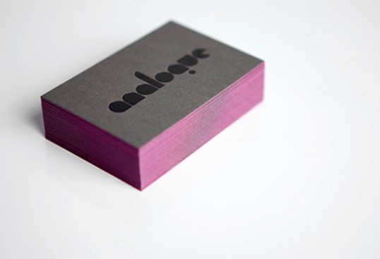
What strengths can you identify in your work and how have/will you capitalise on these?

I feel that the documentation on my PPP blog of seminars and workshops has been a strength during this module. I always make sure to write up notes during and after, so that they are readily available to me at a later date. This has been extremely helpful as this year we have learned a lot of new stuff in terms of industrial experience and design presence. This is an important part of the course, and the workshops gave us a lot of information to take in. If I had left this to the end, I would have struggled to complete the tasks.


In addition to this, I feel that my branding has come out extremely well, and I am truly shocked at how pleased I am with it. Although it doesn't have a massive concept behind it as such, I feel that it really reflects me as a person and as a designer. Through the use of colour, illustration and type, I have been able to create simple design that shows where my interests lie. I also feel that I pushed a range of products during this brief, applying my branding to appropriate formats.
What weaknesses can you identify in your work and how will you address these in the future?


Time management has been a big issue for me during this module. Although I am continually evaluating myself in terms of work on my other blogs, PPP had unfortunately been left behind. By focusing on other modules, I feel that I have left myself with quite a lot of pressure towards the end in terms of getting things done. Although I was organised in terms of print, I feel that I should have been posting to my PPP blog more than I have. I believe that part of this is because of my slight reluctance to start getting in touch with studios. It seemed like an extremely intimidating and daunting process to me, and therefore I put it off for as long as I could. I now realise that I was stupid to think this, and contacting studios has been an interesting and enjoyable experience, that has given me a lot of confidence in terms of work.

Identify five things that you will do differently next time and what do you expect to change from doing these?

1. Begin networking a lot sooner and not be afraid of making a name for myself online. This would have opened up more opportunities for me and I will make sure to continue to update my Behance and start connecting with people on LinkedIn.

2. I wish we had carried through with our Life is a Pitch studio in terms of producing possible designs and products, so we could have displayed the type of things we would be interested in doing. I feel this would have strengthened our presentation and this is something I may consider looking into in the future.
3. I wish I had considered some more inventive and creative ways of getting in touch with studios. I held back slightly as I always have worry and concern when it comes to showing professionalism. However, I need to understand that there is a balance between being professional and showing your personality. I am going to go on to consider some interesting ways to contact further studios that will increase my chances of getting placements.
4. I will make sure to complete tasks as soon as we are given them. Some of the tasks given got a bit lost, and when it came to completing them at a later date, I wasn't as clued up on the subjects as I would have been at the time. I will make sure to do things when I get them so that I am not rushed into trying to complete things.  
5. I will manage my time better, and allow for the right balance between modules. Although things need to be prioritised, I need to remember that I cannot just leave stuff behind as it will never get done .  

How would you grade yourself in the following areas (5 - excellent to 1 - poor):

  • Attendance: 5
  • Punctuality: 5
  • Motivation: 3
  • Commitment: 4
  • Quantity of work: 3
  • Quality of work: 4
  • Commitment to the group: 4

STUDY TASK 10 - presentation

Here is a PDF version of the presentation given on Thursday. I was first to present, and this seemed rather daunting to me to begin with. However, it turned out to really work in my favour as I believe I gave both a confident and professional presentation. I received positive feedback from my peers afterwards in terms of how I spoke and the depth of detail I went into.

STUDY TASK 8 - what is a CV?

Identify a minimum of 10 designer's, studios or practitioners that you intend to contact with a view to organising a range of studio visits. In doing this you will need a full set of contact details for direct mailing. You will also need to familiarise yourself with their work their clients and the set up of their studio/practice.


1. Hato Press


About


Hato Press is a speciality printing and publishing house based in London. They specialise in both screen-printing and Risograph printing processes. The Risograph prints with soy based inks resulting in cost effective prints with unique qualities.
Hato is an ever growing family for other creatives, current in-house members are Justin Bailey, Kristine Bumeistere, Ken Kirton and Jackson Lam. It is a support network established by Ken Kirton, Jackson Lam and Louise Naunton Morgan in 2009 to offer affordable means of production to others so they may share their thoughts and dreams.

Contact Details


You can reach all of Hato Press here: info@hatopress.net
For screenprinting enquiries: screenprinting@hatopress.net


For shop enquiries: shop@hatopress.net
For events enquiries: events@hatopress.net


Or you can follow Hato Press on Facebook or Twitter

Call 020 7729 5585
Skype: hatopress
Or you can meet Hato Press face to face here:
6a Scawfell Street
LONDON
E2 8NG


Work


2. Numiko

About


Numiko solve digital problems for their clients through user research, design and technology across digital platforms. They like working with people who make a difference and have had the pleasure of working with some brilliant clients to help them engage their audiences, from BBC and Channel 4, to the National Lottery Good Causes, NESTA and the NSPCC.
They have a team of 24 talented people working across a variety of disciplines such as research, user experience, strategy, design and build.

Contact

Numiko Ltd.
46 The Calls, Leeds.
LS2 7EY


0113 202 1400

hi@numiko.com
@numiko

Work


3. Vincent & Bell


About

Vincent & Bell are a graphic design agency based in Carlisle, Cumbria. They like making things look great for their clients. They design brands, brochures, magazines and websites.


Contact

26a Castle Street, Carlisle CA3 8TP


01228 541772


hello@vincentandbell.com

Work


4. Elmwood


About

They help brands uncover what's special and different about themselves and tell the world about it. There's the thinking and words in brand strategy and brand language through to the visual magic of corporate design and packaging design. Their digital work brings all this together. 


Contact


Elm­wood Design Ltd.
105 Water Lane
Leeds
LS11 5WD
E: enquiries@elmwood.com
T: +44(0)113 318 4500F: +44(0)113 242 5830
Work


5. PENCIL Agency


About

Pencil specialises in story telling. Branding, advertising campaigns, viral films, brandzines, catalogues and bespoke events are some of the tools they use regularly to help clients develop their own unique narrative. 


Contact

PENCIL

8 Golden Square,
London, W1F9HY

+44 (0) 207 7343 -528


hello@pencilagency.com

Work


6. The Beautiful Meme


Contact

+44 (0)1904 673767


everyone[at]thebeautifulmeme.com


[at]beautifulmemes

7. Qubik


About

Qubik is a graphic design studio founded in 2000 by Joe Gilmore. Specialising in typographic-led design for branding, print and digital media, the studio works with a variety of clients in the commercial and cultural sector. Our work includes design for branding, content managed websites, books, catalogues, brochures, posters, leaflets, signage and packaging. In addition to client-based work, the studio initiates and produces independent curatorial and publishing projects which focus on typography and graphic design.

We are very passionate about graphic design. Through developing collaborative relationships with our clients and partners we aim to create original, functional and distinctive work that engages users, satisfies the objectives of the client and meets the high standards and creative innovation that are central to our studio practice. 

Contact

5 Cricketers Terrace
Leeds, LS12 1ST
United Kingdom


+44 (0)113 226 0839 


studio@qubik.com

Work


8. UNIT


About


UNIT is a diverse graphic design practice based in Leeds LS1 & LS13 founded by Si Billam in 2010.

Our work ranges from public art installations and global branding to local government, regeneration projects and music industry art direction.  We have built a reputation for producing creative solutions that go beyond the traditional boundaries that graphic design is contained within.

Although still in our infancy, our work has already reached across the globe as far as the US and been featured in exhibitions in Europe — most recently at a fringe event to the famous SONAR festival in Barcelona.

Prior to establishing UNIT, Si was a former Senior designer with the world renowned ‘The Designers Republic’ based in Sheffield. His work ranged from rebranding MTV Italy (QOOB), creating global campaigns for Coca-Cola to projects with independent artists, record labels and architects. After his time at tDR he spent 3 years working as Senior Designer & Art Director at Leeds based Vast servicing clients within the arts, fashion, property and regeneration markets. Si’s work on the independent fashion magazine ‘Shufti®’ led to the publication winning both Gold & Silver prizes at the Graphis and SPD awards in New York 2009.

Contact

LG3 Studio, 30-34 Aire Street, Leeds LS1 4HT.


+44 (0) 7968 844 061

info(at)weareunit.com

Work


9. Big Fish


About


Big Fish is a brand, design and marketing consultancy that’s spent the last 19 years helping people build brands.

Since we started in 1994 we’ve created over 100 brand identities, 1,000s of items of literature, gazillions of packs, written umpteen brand strategies, 50 marketing strategies, a hell of a lot of words, designed & built over 100 websites, art directed over 1,000 photoshoots, shot many 1,000s of high definition images in our photographic studio, written, designed & produced 140 press ads and have directed & produced our first cinema commercial.

In short, we name brands, position them, give them identities and personalities. Then we help develop what they do, identify who they do it for, put them in touch with each other, write the words, draw the pictures, design things, photograph and illustrate stuff, create online tools to help track progress and research new ideas and probably a whole lot more.

But most importantly, we only choose to work on projects that we have a personal belief in and that we would be consumers of ourselves. That way we always get it. All we ask is that our clients keep an open mind, display our credit on everything we do, pay us on time and enjoy the process from beginning to end.

We’ve been lucky enough to work with some incredibly talented people and great companies over the last 16 years. Take a butcher’s at our client list.

Contact

+44(0)20 7795 0075 

studio@bigfish.com

Work
10. Studio MIKMIK


About

Studio MIKMIK is a graphic design and illustration studio established in 2006 by Michael Lewis.

We create well crafted solutions for print, identity, illustration and online projects.

By working with Studio MIKMIK you'll receive a friendly design service where every project is handled with care and attention to detail is paramount. From first meeting to final delivery, no matter how small or large a project, you can be assured that every question will be answered and cups of tea will never be far away.


Contact

Studio MIKMIK
65 George Street
Saltaire
Shipley
West Yorkshire
BD18 4PL
United Kingdom


hello@studiomikmik.com

Thursday, 30 May 2013

CONTACTING STUDIOS - further replies

We were quite surprised at how fast certain studios got in touch after sending out our e-mails. Although some stated they don't do visits, we have received a number of really positive emails concerning visits, portfolios and the possibilities of placements. I feel a lot more at ease about the whole process now, and feel that I will easily be able to send out emails as an individual over the summer.


We have now began to reply to these studios in terms of dates and when is best to meet up!

Wednesday, 29 May 2013

CREATIVE CV - cv parade

I found an extremely useful website that has a massive archive of creative CVs. This has really given me an insight into creative thinker's CVs in terms of layout and content, and has put me at ease when creating my own.


http://cvparade.com/

DESIGN PRESENCE - branding and promo pack

Tuesday, 28 May 2013

DESIGN PRESENCE - edge painting

A few examples of some really effective edge painting on business cards. I feel that edge painting adds a completely new dimension to such a small format. It allows you to add colour in a number of different ways, including the use of fluorescents, foils, metallics and even gradients. The edge colour can really compliment the card design, or it can really make it. It is a really effective way of adding in colour that hasn't been used within the main design of the product.


Nikki Nischke


Analogue


Shyama Golden


Dingbat Press


Mike McQuade for Tom Dick and Harry Creative Co.


Parrott Design Studio


Aerialist Press


Deutsche and Japaner

DESIGN PRESENCE - edge painting

When taking my business cards into consideration, I really want to have a go at edge painting them. I had it in my mind at the very beginning that it would be a really cool and effective way of making them pop and stand out. I am hoping that this will be simple enough to do by hand, and I have therefore done some research into how this could be done.


Edge painting can be done in any colour, and can even be done using metallics and foils.

The Process -  Michael from Czar Press 

The edge painting process takes place after all graphics and text have been printed and all paper materials cut down to size.  For this example, we’re focusing in on a recent business card project.  I like to make sure my blade is especially nice and sharp when trimming out cards that are going to be edge painted.


Edge painting involves a padding press (pictured above), ink, and a brayer.  The cards should be stacked on the padding press, making sure that the cards are pressed against one wall of the padding press as evenly as possible.  Crank down the vice(s) on the press, applying pressure to the cards, making them nice and snug.  Remove the outer wall off the padding press, leaving one side exposed.  This the side that will receive the ink.


Then using just a little bit of ink, ink up your brayer.  Roll the brayer around and around on a piece of glass if possible in attempt to make the ink spread even across the brayer roller.  Then I apply the ink to the exposed side of the card, applying as little pressure as possible with the brayer to get good ink coverage on the cards.  Once the ink has been applied, I like to gently wipe down the inked side of the cards with a cotton cloth to remove any excess ink.


Let them dry for a while – maybe an hour, depending on conditions – until they are dry to the touch.  Put the outer wall back on the padding press, spin the cards around to the next side and repeat until all sides are complete.

DESIGN PRESENCE - organisation

Organising myself in time for print!


DESIGN PRESENCE - business card alignment

As I have aligned my website, CV and cover letters to the left, I have decided that everything else should also be left aligned. When looking at my business cards, they didn't quite look part of the range as they were right aligned. I have now changed this to make sure everything works as a cohesive whole.

I have also changed my website to my Behance address, and set the phone number out in the correct manner.


DESIGN PRESENCE - new CD and promo pack

After carefully considering how my promo pack would be put together, I realised that perhaps that tabs I used weren't the most efficient way of displaying my work. I therefore did a bit of research and realised that simple slits could be used to hold all of my products. The tabs have now been removed and replaced with these slits.

I also realised that the tabs probably wouldn't hold a CD, and I didn't want it to keep slipping out, or to fall when the book was closed. The best option would therefore be to place the CD within a case. This is something I should have considered beforehand.

Below is the simple CD cover that will hold my CD. I didn't want to include my initials on the front as I felt that this was becoming slightly overused within this pack and I didn't want to push it too far. I therefore used the same type and layout as previous products, and my website, to state my name and what the CD is.

I have also decided to change the alignment of my logo and text. I will now have everything left aligned in order to fit in with my website, CV and cover letters. This will now be changed on my business cards also.


I then needed to consider the sticker for the actual CD. As this is hidden, I felt it was ok to put the logo on, as it wouldn't be seen until removed. I also wanted to include my name and it's purpose, in case the CD cover was lost.

The main reasoning behind the positioning of the type is that when you begin to remove the CD from it's case, this is the first thing you will see. I thought that was an effective feature, and it shows that all aspects have been considered. 

Below is a mock up of how the CD and case will look once printed. This will then slot into the promo pack below the business card using simple cuts in the paper. 

CONTACTING STUDIOS - getting replies

We have now started to get some replies from some of the studios we have emailed. Myself and Jenna will now take the time to get together and figure out when is best for both of us to visit the studios. Exciting stuff!


DESIGN PRESENCE - creative CV development

As part of my promo pack, I wanted to create a booklet that would hold both my CV and my business card. This would be intended for clients and studios so that they have both pieces of information. I wanted to include my pattern within this pack, however, I had to consider the fact that my business card also features the pattern. I therefore came up with the idea of reversing the two colours so that the three formats don't all blend into one. By using the pink as the background colour, I am allowing for a clear contrast between this and the white CV and business card. I may also print a version with the original pattern just so I can see which is most effective. 


Originally, I was going to have my business card on the right hand side, and my CV on the left. These would be held in little cut out tabs. However, I need to consider which item I would want the client to see first, and I feel this may be my CV. Therefore I will have to swap the two around. The positioning of the business card also needs to be considered, as well as how to hide the tabs on the reverse.

After some consideration, I decided that the best option would be for me to include my CV and a disc of work within this pack. I feel that the business card may look slightly out of place, and would get lost within the scale of the product.


I then went on to make my creative CV, using a similar layout and style to my cover letter.


Putting the CV into the mock up pack.


Including business card as well as CD.


Mock up of promo pack