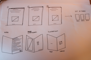
Now that I had my illustrations, I needed to consider how I was going to display each different price category. I also decided that my booklets were going to A5 in scale, in order to make them pretty compact and manageable.
Here are some simple front cover designs created using the illustrations in the previous post, just adding a bit of colour. These effectively show the content of each book without being too fussy or over-complicated, and the images work well as a centre piece to the cover.
Below are some possible opening pages for each booklet that clearly shows the range, a small list of unnecessary products, and a quote taken from students on the course stating what leads them to purchase things they shouldn't.
I chose to use Helvetica to keep things clean and simple, in order not to contrast with the illustrations in the rest of the booklet and the colour choices were inspiration taken from Rafael Bessa's work. I tried to create a gradient of colours, so that as the price increased, the colour of both the background and text became darker.
Although I am not 100% happy with how these designs pair together with the covers, I am going to see how they work within the booklet before scrapping them altogether.
Next, I moved on to creating the pages that displayed the necessary items for a Graphic Design student in first year. I wanted there to be a contrast between illustration and text, therefore I decided to place them on facing pages, making sure all focus was on these items.
Click to enlarge
£0 - 5
£5 - 10
£10+
As the target audience is Graphic Design students, I wanted the content to be something that would not only be useful to them, but also something that aesthetically interested them. I didn't want to bombard them with a load of content on these pages, they were to be simple, clean and to the point, whilst making the products look 'appealing'. Some explanation was going to have to go somewhere, otherwise the booklets would become a little bit confused, however I felt that these pages worked well with little else on them.


No comments:
Post a Comment