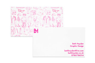
Now I had my chosen pattern designs, I could then begin mocking them up into the context of a business card. This would allow me to see how they would look in terms of print and format. I included both the pink and black print, as I am possibly going to print out a number of each to allow for variety.
I could then begin to create the reverse of my business card. This is something I wanted to keep simple, as the front is quite busy and slightly complex. Only the most important information was to be included: my name, subject, email, website and telephone number. This would then allow a range of methods of contact when handed out. The type used is Futura, as it blends nicely with my illustrations. It is also quite playful, which is reflective of my design and personality.
I then went on to consider the possibility of a sort of "logo". This would be made up of the initials of my name. I felt that this needed to be included, as it would need to be applied over other objects such as my CV and cover letters. Although the pattern would play a role in this also, I wanted to make sure that I had a name I could use on my website.
In terms of my initials, B H and b h don't fit together all that smoothly. A lot of my peers have initials that mix together in really interesting and creative ways. However, I personally hate the letter B, and it really annoyed me that I couldn't think of a really innovative way of joining the two. I didn't want to simply place my initials next to each other, therefore I came up with a way that would allow me to display them together.
Below, is how I have managed to achieve the above. Although quite simplistic, I feel that it is effective, and it is still obvious what the two letters actually are. I didn't want to over complicate the whole process. I believe it looks professional, and works well alongside my illustrations.
Below I have experimented with some possible layouts, in terms of where I can place my initials.
As I started developing the website, I began to realise that perhaps my colour choice has been a little off. Although the bright pink is quite vivid and eye catching, I don't think it quite reflects my practice and my personality. This was extremely noticeable when it came to creating my site, as the bright pink just didn't fit in with any of my work, and didn't seem to allow me to reflect myself the way I wanted to. I am therefore considering using this paler pink. Although not as eye catching, I feel that is more relevant, and reflects a lot of the work I have produced up until this point. I am much more into using pastel shades than bold colours, and therefore believe this to be more appropriate.
I will have to see how this colour prints in order to make any final decisions.


No comments:
Post a Comment